Project

About project
About project
About project
The founder of the Data Science Kazakhstan (DSML KZ) community of data scientists in Kazakhstan approached Doubletapp for a new identity: the team needed to make their communication channels more recognizable, professionally designed in a unified style. This will facilitate the search and interaction of data scientists with information through reliable channels. It should be immediately clear — these are the channels of a specific community, meaning this information is reliable and trustworthy.
The Data Science Kazakhstan (DSML KZ) community of data scientists in Kazakhstan was established in October 2017, uniting 5000 participants. Its founder, Ainur Aymoldin, worked in the field of Data Science and actively shared professional information on Telegram, which was interesting and useful to both beginners and those interested. The number of participants and the amount of information tools grew, the community actively engages on Facebook, LinkedIn, Instagram, YouTube, develops several Telegram channels, Job Boards with vacancies, and also holds offline events: IT conferences, seminars, job fairs, workshops, etc. Over 6 years, the number of participants in the association has grown to 11,000.
In 2 months, the Doubletapp design team recreated the community's mascot, developed a logo and a general modular principle of image construction, a color palette, and a set of fonts.
Task
Task
Task
The community's information platforms were developing very rapidly, and for the owners, the content was more important than the unified style—illustrations, fonts, layout templates, etc. In early 2023, the founder of the community, Ainur Aymoldin, considered developing branding and original identity and approached Doubletapp with this request.
Solution
Solution
Solution
The project presentation took place on May 16, 2023. Pavel Laptev, the head of the design team, and Doubletapp CEO Sergey Anchutin went live to share the new identity of the community with the world. The results of their work were evaluated not only by the clients but also by all the viewers of the stream, who asked tricky questions about the design and the work of the DSML KZ community.
Pavel Laptev prepared a usage guide for the identity, describing the modular principle of composition building, layout templates, and printing options for different mediums (merchandise, printed materials, etc.).
DSML KZ channels are already actively using the newly developed identity, and now the community of not only Kazakhstan but also the CIS countries finds it easier and more comfortable to recognize and identify authentic information among many sources.

Design


Figma


Adobe Photoshop


Adobe Illustrator

Our super team
 PavelDesign
 KseniyaDesign
 IlyaDesign
 OlegDesign
Implementation
Implementation
Implementation
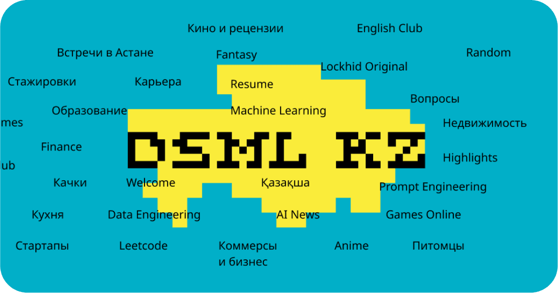
The design team analyzed what the community represents, how many and what types of information channels it operates (the range of topics was wide — from professional issues to discussions about cooking and pets), and what visual and semantic elements it uses. DSML KZ had a slogan: Deeper is Better. This is a professional meme: data scientists seem to do nothing but add new layers, use increasingly "fatter" models, and to improve the model, you need to delve deeper. From the slogan came the logo in the form of a diver who dives as deep as possible. Completing the lineup of visual elements was a gnome mascot busy coding. With this set, they began their work.
We studied the community format: closed, people are interested in specific professional topics, job search, but are not averse to discussing universal human issues; communication is friendly, newcomers are supported, and there is a lot of humor.
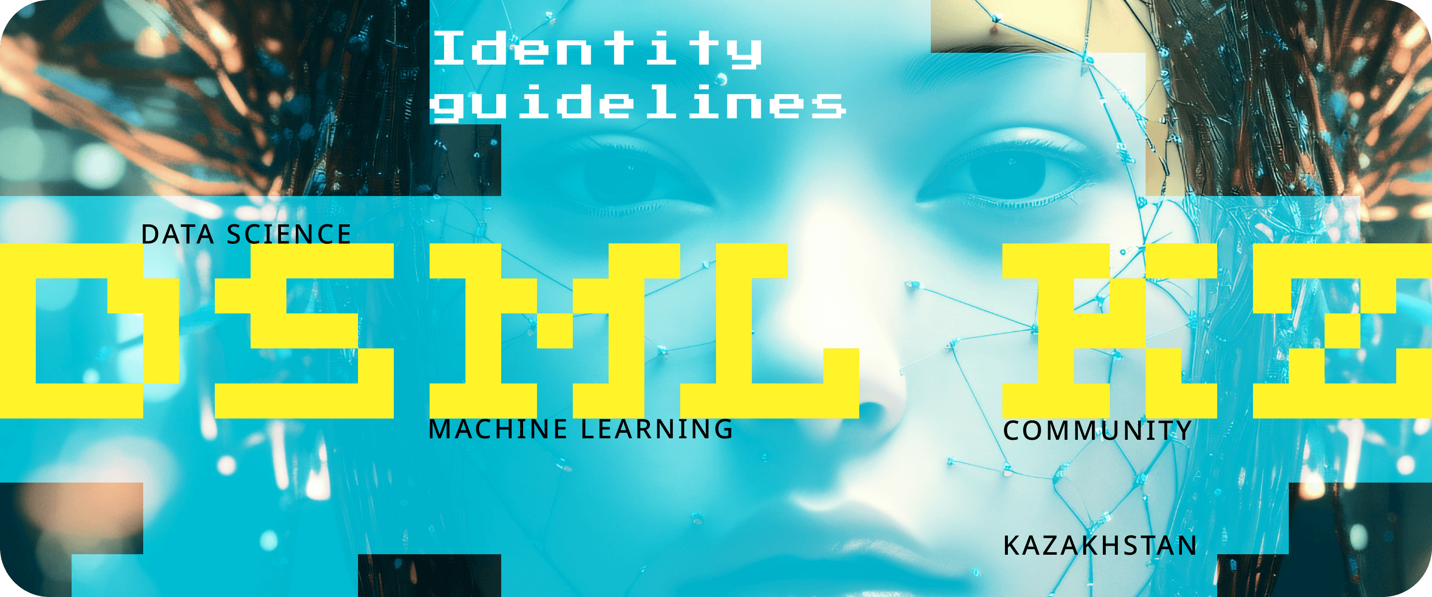
The clients immediately asked to move away from traditional visualizations of the Data Science theme — glowing lines, brains, space, and dots — and also to add national flavor — colors of the Kazakh flag. As a result, the ratio of yellow and blue was decided by their proportions on the national flag, and the map of Kazakhstan was used as the background.
Designers studied how the theme is played out in the top global Data Science community — many of them had standard images as logos — an image of a network, code, or monitor. They decided to approach it from a completely different angle, from abstraction, from the idea of a constantly changing array of data. Pavel Laptev pixelated the font, animated it, and took several of the most successful versions — striking, stylistically and graphically suitable in the image.
The developed identity system reflects the modular principle as a metaphor for a community consisting of chat modules.
Insights, Hypotheses, Creation Process
Insights, Hypotheses, Creation Process
Insights, Hypotheses, Creation Process
What is the modular principle? The concept of modularity is that elements of a common solution are developed and can be used autonomously, which is due to their relative self-sufficiency. By developing one module, the designer obtains both a form capable of independent existence and a composite composition that becomes more complex with the addition of modules or sets of modules.
In our project, the modular principle works like this: the composition must be proportional, the size of elements is a multiple of a conditional pixel or the height of the letters of the logo.
As a display font, Pavel used the Noto Sans grotesque: it is simple and strict, provides good contrast with the logo, but most importantly, it also includes special characters — symbols found in Kazakh writing. This font is open source and free (there are few fonts on the market that meet all these requirements). Choosing this option fully meets the task requirements — availability, presence of all font elements for setting any text.
For headlines, slogans, and key points in the text, we chose Press Start 2p. This is a display font — contrasting, emotional, and deliberately decorative. It fits into the concept because it mostly corresponds to the overall style of the identity (pixelated, modular), echoing the logo and branded pixel badges.
Compositionally, all graphic elements are based on a basic square element, a conditional pixel — the logo consists of squares, of pixels, fits into a square, is organized inside a square. This gives us a variety of stylistically unified options.
According to the designers' concept, images for backgrounds are generated in neural networks — this is conceptually justified. These compositions can already be used to design anything — from social media covers to car stickers or fridge magnets.
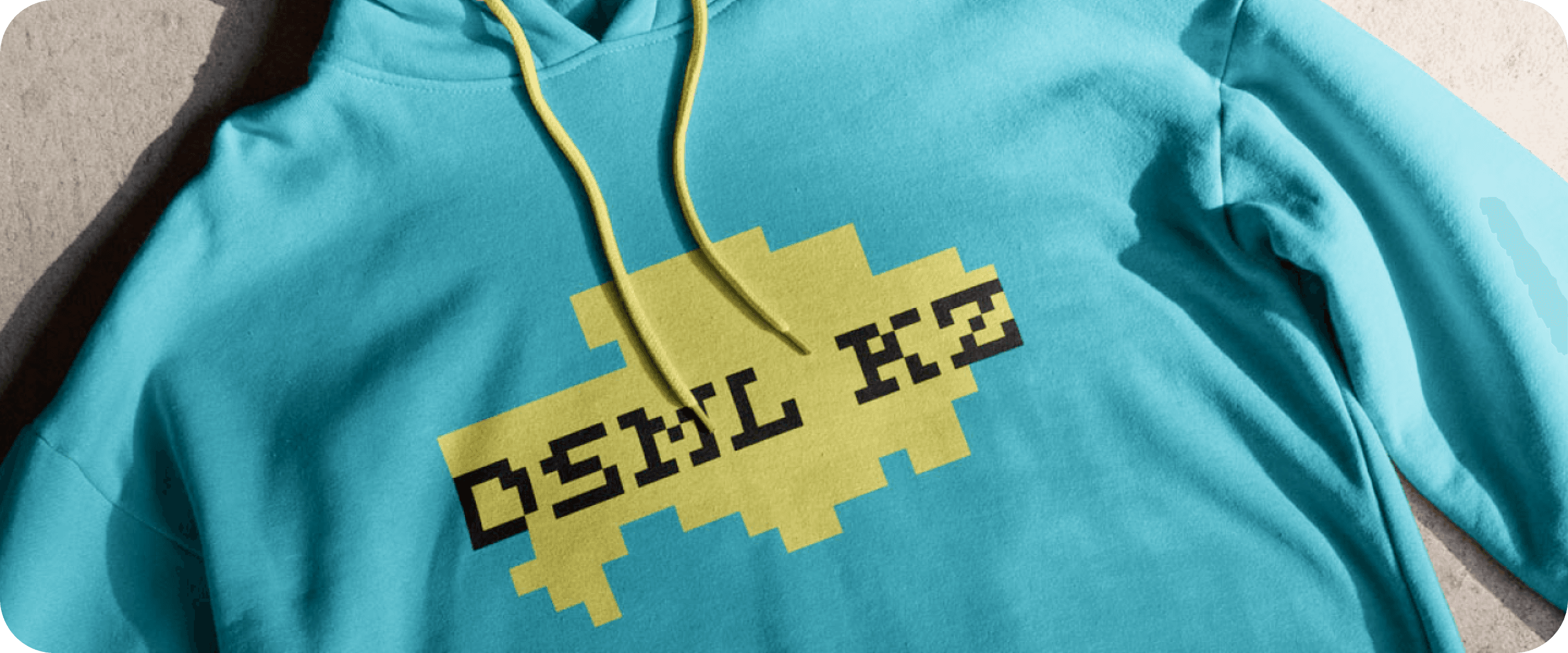
We applied the identity to real media — business cards, prints, merchandise, social media.
Designers developed a layout principle using graphic elements: display and low-volume text is tied to key objects, badges, and backgrounds. The composition is built according to the algorithm: logo + key image + pixel silhouette + thesis.
Thus, the modular principle gave impetus to the development of the entire set of identity elements in a unified style. Moreover, it allows creating an infinite number of variations while staying within the brand's recognizability.
Illustrator Ksenia Popova was responsible for drawing the mascot. The client provided the artist with creative freedom: it was possible to create a new character or adapt the old one to the new branding. Ksenia came up with a way to integrate the character with the pixel logo — using simple geometric shapes and applying the colors of the new branding. Our Databek ("Data" — data, "bek" — a popular ending of a Kazakh name) has 7 drawn poses, and his characteristic appearance and national headdress give him a pronounced "Kazakhness".