Project
About project
About project
About project
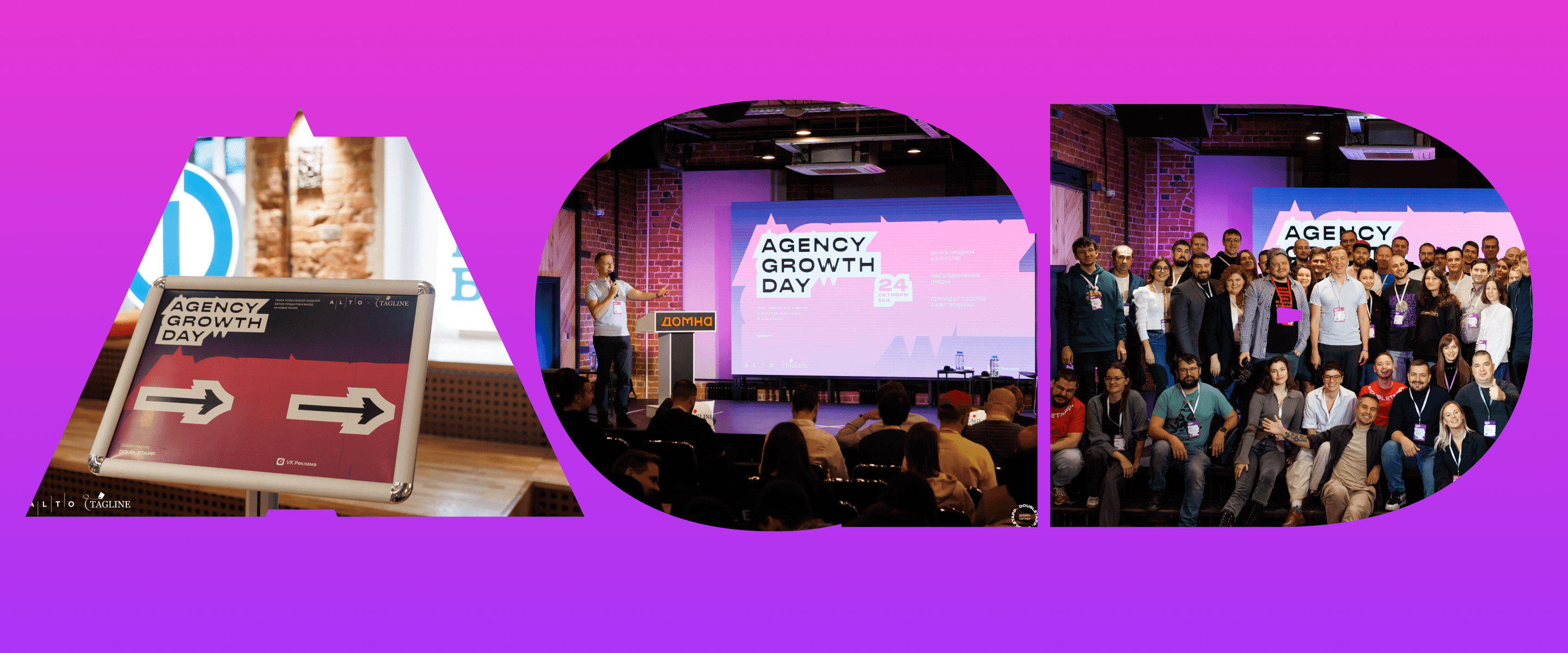
On October 23–24, the Agency Growth Day 2023 took place in Ekaterinburg. This conference annually gathers industry representatives interested in exploring the inner workings of their businesses, sharing failures, and seeking advice. This year's event lasted two days:
• On October 23, conference participants visited the offices of four very different Ekaterinburg companies, learned about their businesses, and interacted with their leaders.
• On October 24, the conference itself took place — with six speakers in the first part and business discussions in the second part: participants shared their company's problems and received expert advice.
The conference organizer, Alto, is our good friend and colleague. Before the conference began, they asked us to assist with the visual design of the event. Ultimately, Doubletapp became the design partner of the conference: our specialists immersed themselves in the theme and devised a concept from which all visual elements of the event were born.
Task
Task
Task
For last year's conference, Alto already had a website, but the design didn't suit the company. In 2023, the client wanted a landing page whose visual style was conceptually linked to the conference theme. And of course, assistance was needed in designing social media, screens, signs, and other visual elements of the conference's "attire."
The landing page was released on September 1. The site was constantly refined and updated — during the conference, a group of proactive founders decided to release a humorous alternative ranking, styled in the main website's theme. Literally within an hour, the new landing page was prepared and presented on the same day.
Immediately after the event, most blocks were replaced with new ones to showcase results, presentations, presentation abstracts, and to provide a registration form for participation in the new conference, etc.
After the conference, the client decided to retain the design concept for the next event, planned to be held annually. The website will be active throughout the year to attract participants to Agency Growth Day 2024.
Solution
Solution
Solution
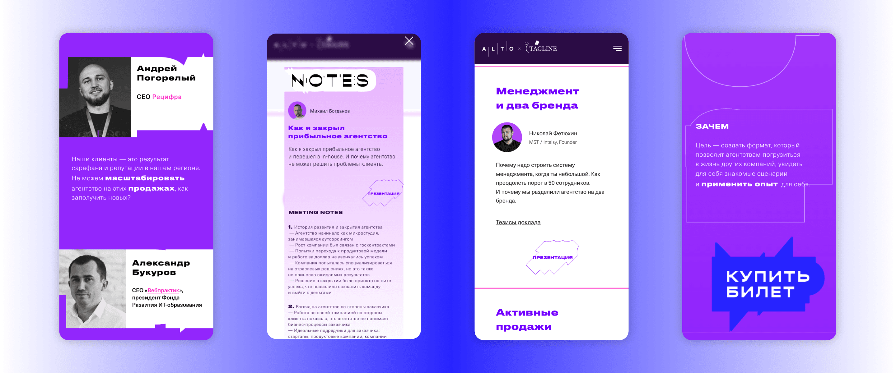
During the conference, the website provides all the necessary information for attendees to form an impression of the event and participate:
• event schedule for both days
• speaker information
• presentation abstracts
• registration form
• ticket purchase form
• videos from previous events and live streams of the current one
After the conference, the content structure changed — now users can learn in detail what interesting events took place at the conference and submit applications for future events.
No information is lost — users can review presentation abstracts, watch videos of speeches, and extract useful lessons from others' experiences.
Design
Our super team
 TatianaDesign
Process
Process
Process
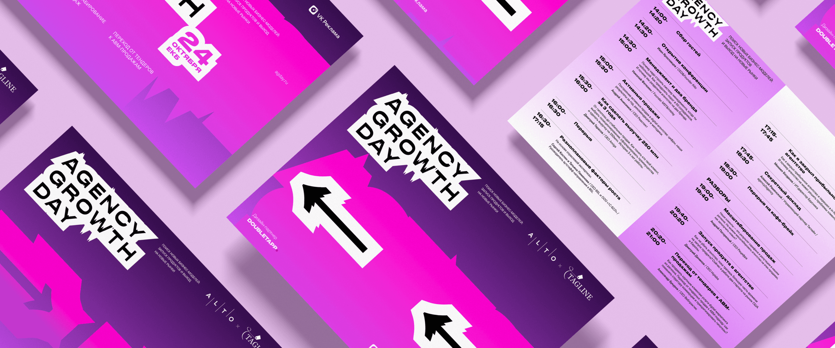
Doubletapp designers came up with a metaphor that illustrated the conference's idea and helped to unfold it through visual tools. Usually, leaders try to maintain a positive image and talk only about the successes of their business. But at the Agency Growth Day conference, people talk about the flip side of business, seek advice, and share problems — showing what is not usually shown, and emphasizing it.
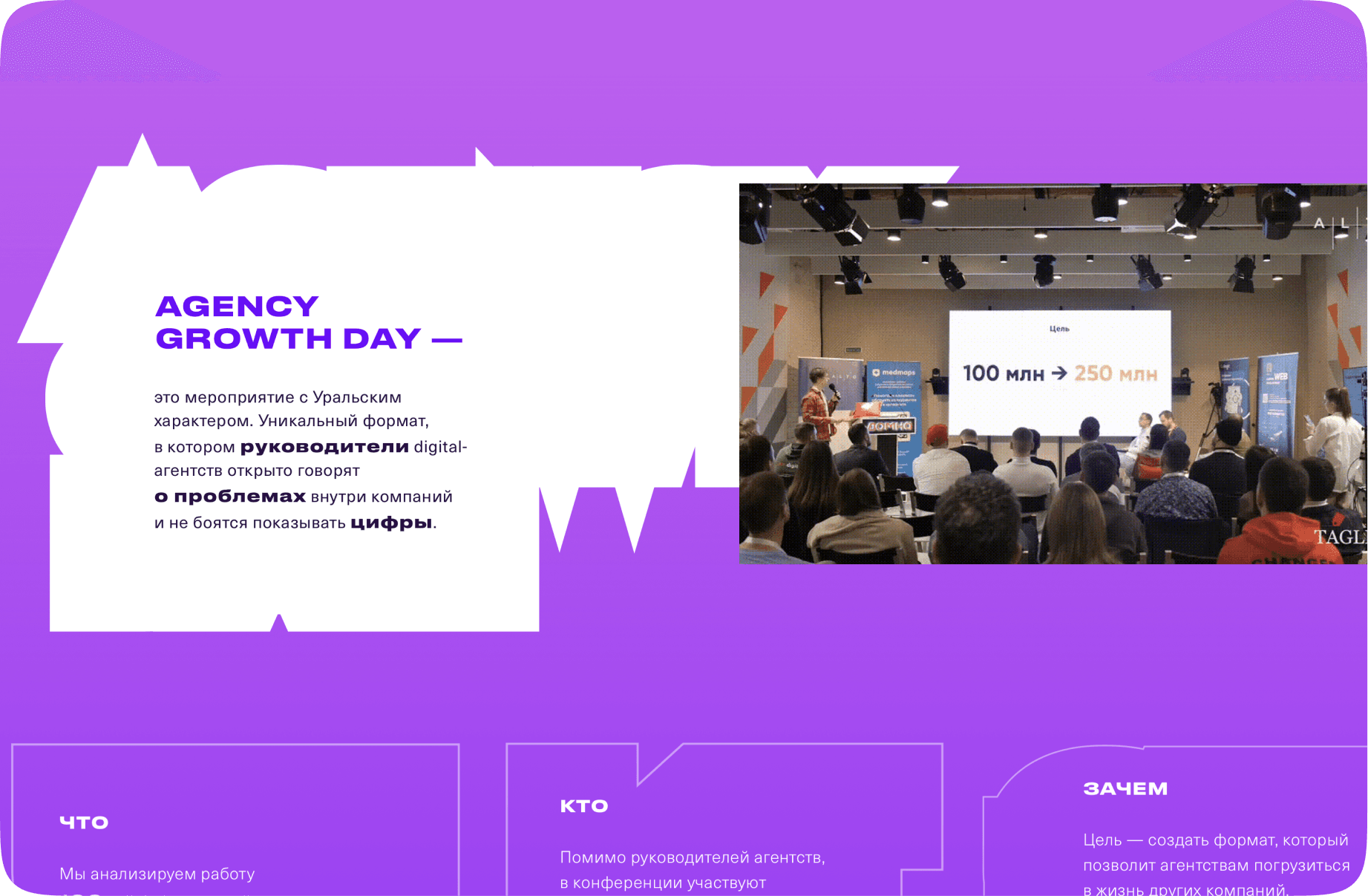
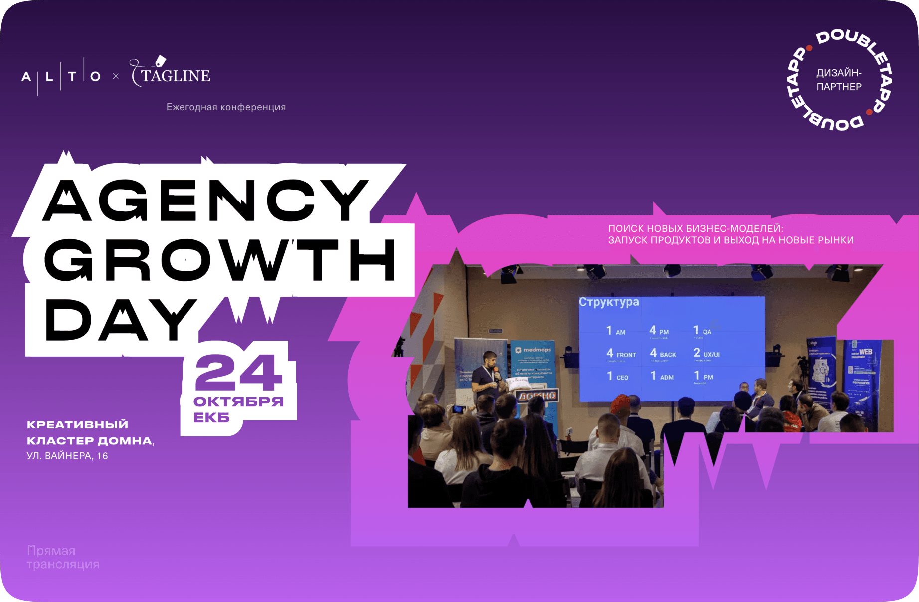
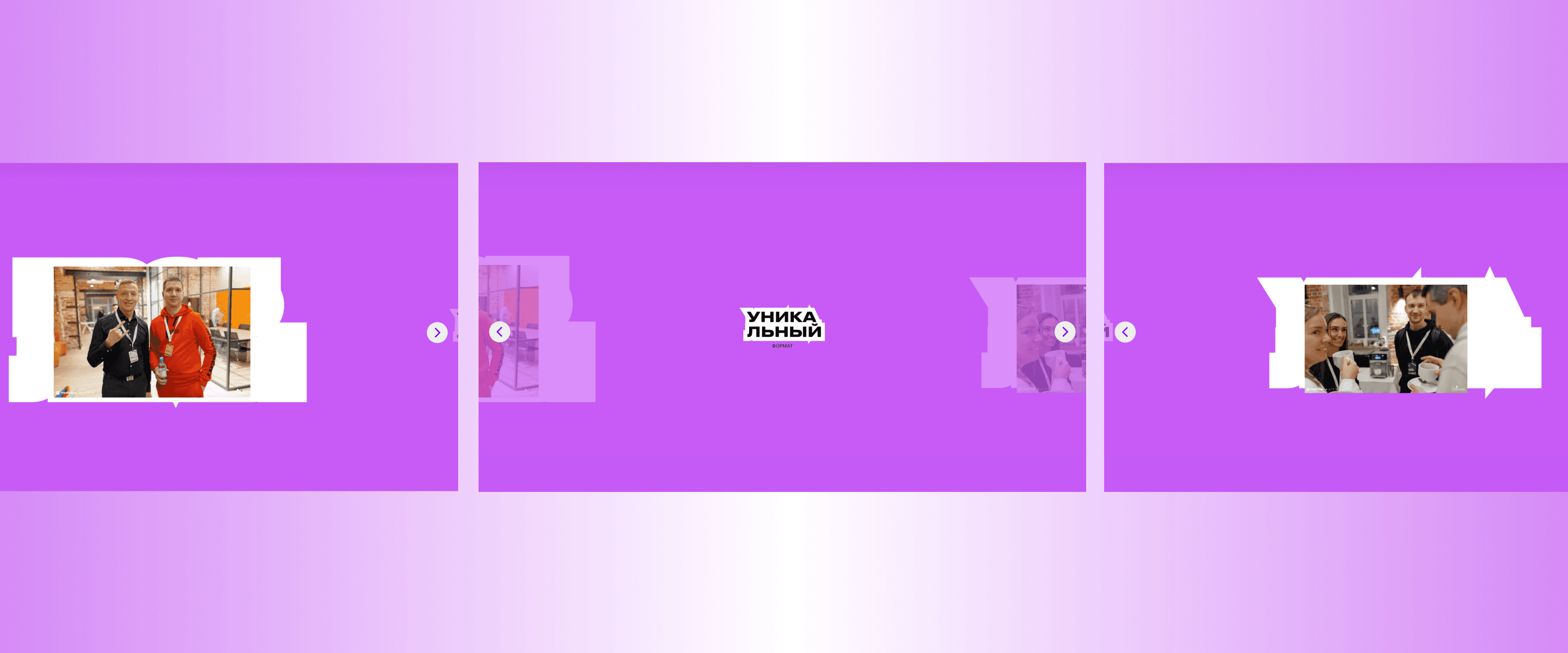
As a metaphor for the flip side, there is an exaggerated outline of the letters in the event name and trigger words ("from the inside," "problems," "figures," "unique," "Ural"). This formed the basis for the development of the visual language — unique shapes that not only provide their own individual image but also allow them to be used as backgrounds or additional graphics instead of typical rounded rectangles.
The conference website is bright, engaging, and informal — expressive color options were used to achieve this, transitioning from bright shades of purple to vibrant shades of blue and pink. Everything is designed to evoke an emotional response and leave a lasting impression. The layout blocks are also non-standard — these are not typical Tilda tools but Zero Blocks, a format for professional designers that allows for implementing ideas for individual adaptive website design and creating a unique design.
Review
